Font research
As part of our film research i'm going to find several different fonts that can be used in a film opening and discuss which one I think will be the most useful.
1. Stand by action
2. Action Force Normal
Similar to the previous font it is big and bold so it will be easy to read. However, whats different is that the style of the font makes it look like it's from a computer screen which is commonly seen in modern action films such as the some of the new James bond films like Skyfall (2012) and Spectre (2016)
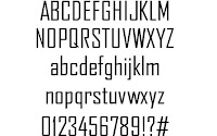
3.Agency FB

This is a good font because while its thinner than the other fonts all letters can be upper and lower case. This is useful because I could use the upper case font for character names and the films title and the lower case font for small text for minor roles such as the behind the scenes crew names.
4.Metal Gear

What I like about this font is the style of it making it look like its is from a computer similar to the Action force font I talked about earlier. but it's much thicker so it easier to read. However because of the style of the font it may be hard for some people to read so I may only use this font for the title of my film and another one for the rest of the writing.
5 Johnny Fever
This font is based on retro action films which can be seen through the bold style of the font which was used a lot back then for film titles so I may use this font for the film title as while not common it's still used to this day.
6. Megatron
Similar to the Johnny Fever font this font is based on the Retro Transformers TV show title. However, it is also used for names and things in the title sequence (character roles). Also, the fonts style looks robotic and futuristic (fits the shows theme) so I may use it in my film opening as it resembles some machine like fonts that are now used today.
7. Hauser
This font is a lot like the Action Force Normal font as both are bold and thick. However, the difference is that Hauser is not tilted and is instead straight which may make it easier for some people to read.
8. Impact
The impact font is thick and bold like most of the other fonts I already mentioned . However whats different is that all the letters are really close to each other so this makes them stand out more compared to other fonts so it may be good for the films title.
9. Blade Runner
Like the name suggests this is the font for the action film Blade Runner (1982). What I like about this mod is that while it has its own style (the line through all the letters) it can still be easily read as it stands out because its in bold.
10. American Captain
The final font I may use is based on the title font in the Captain America films. Firstly, the letters are notably larger and thinner than the other fonts so they still stand out compared to the others.


No comments:
Post a Comment